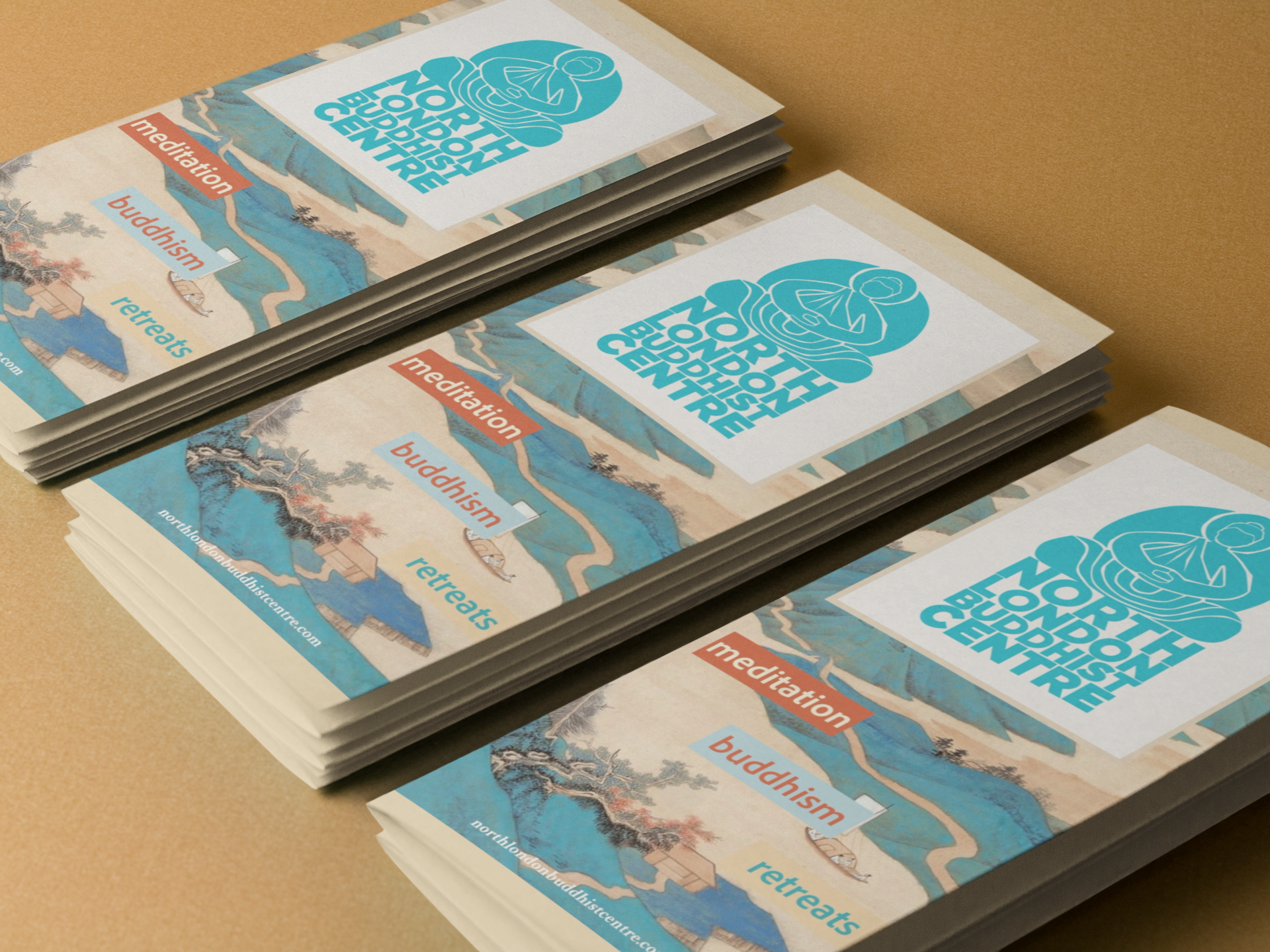
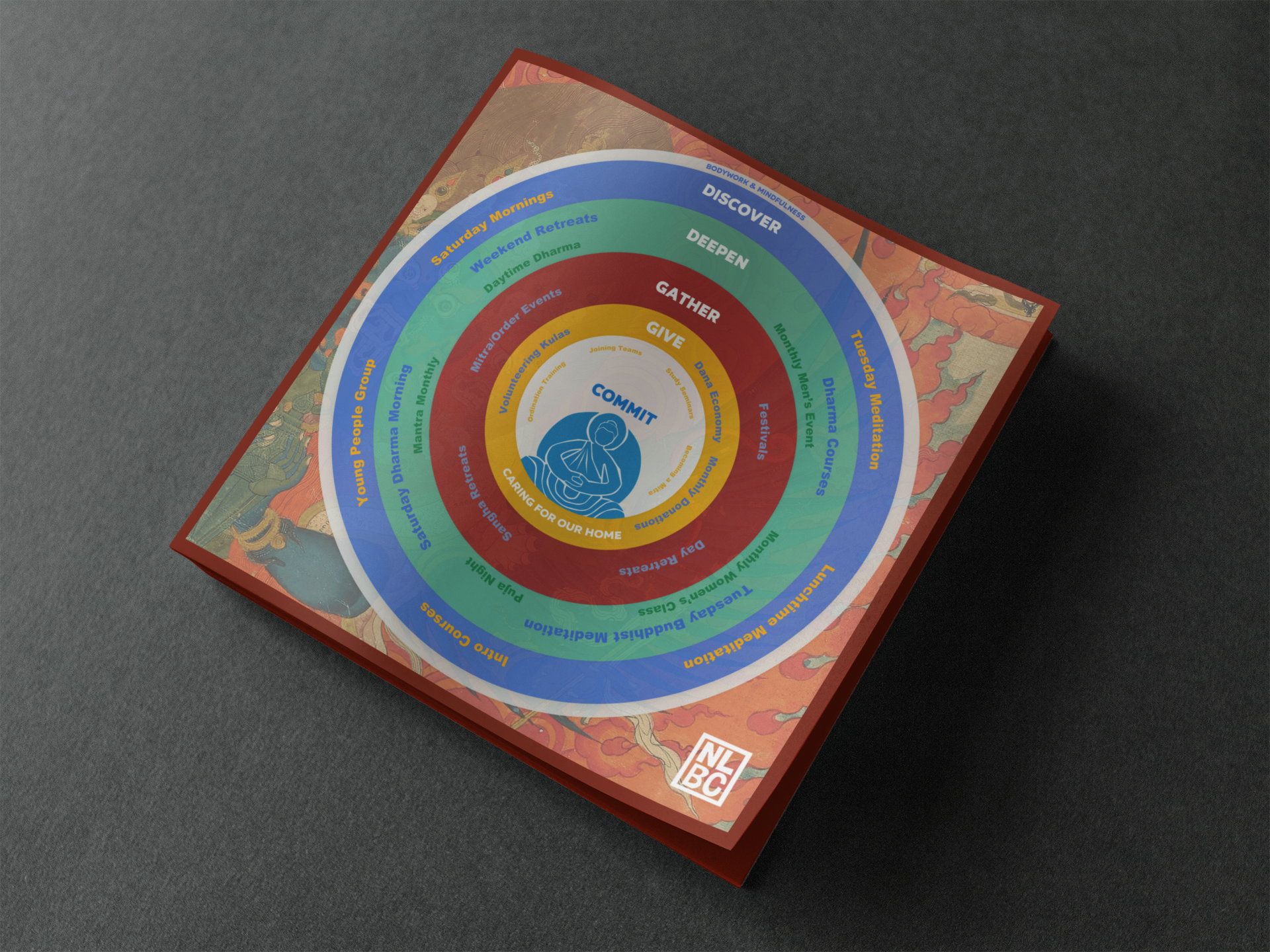
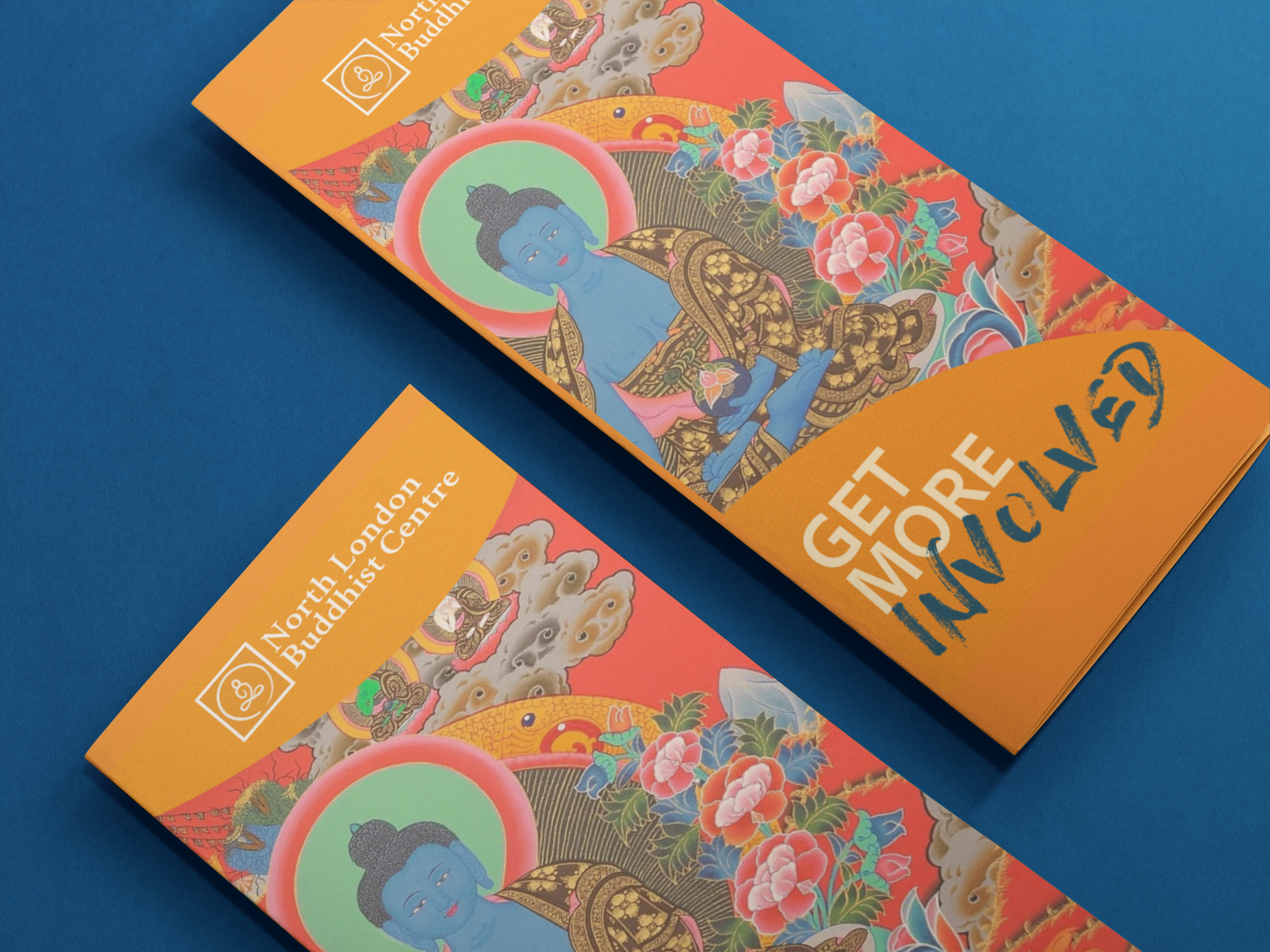
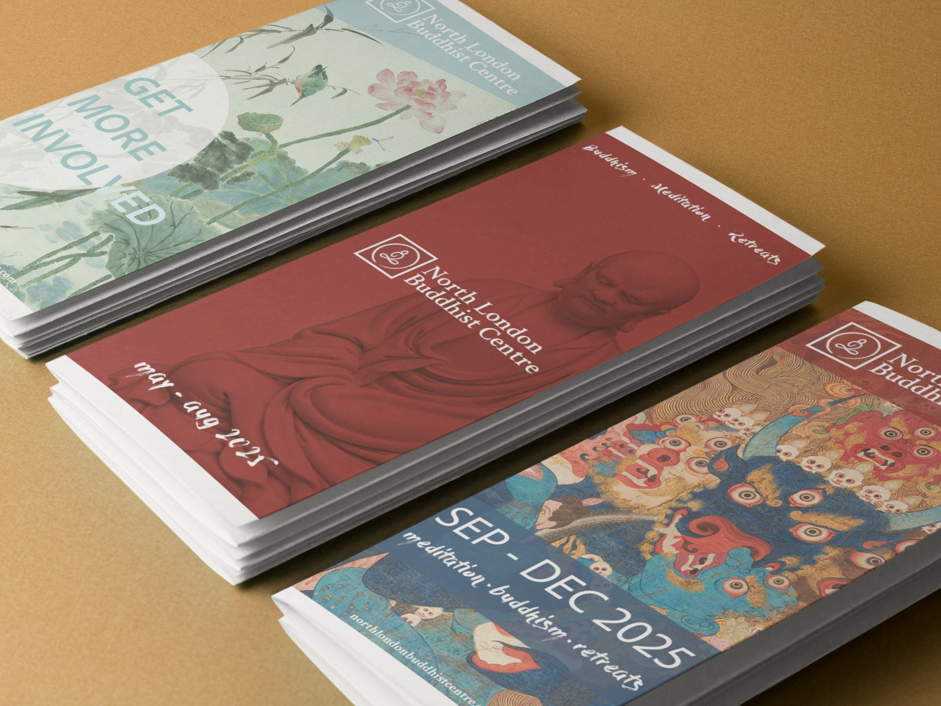
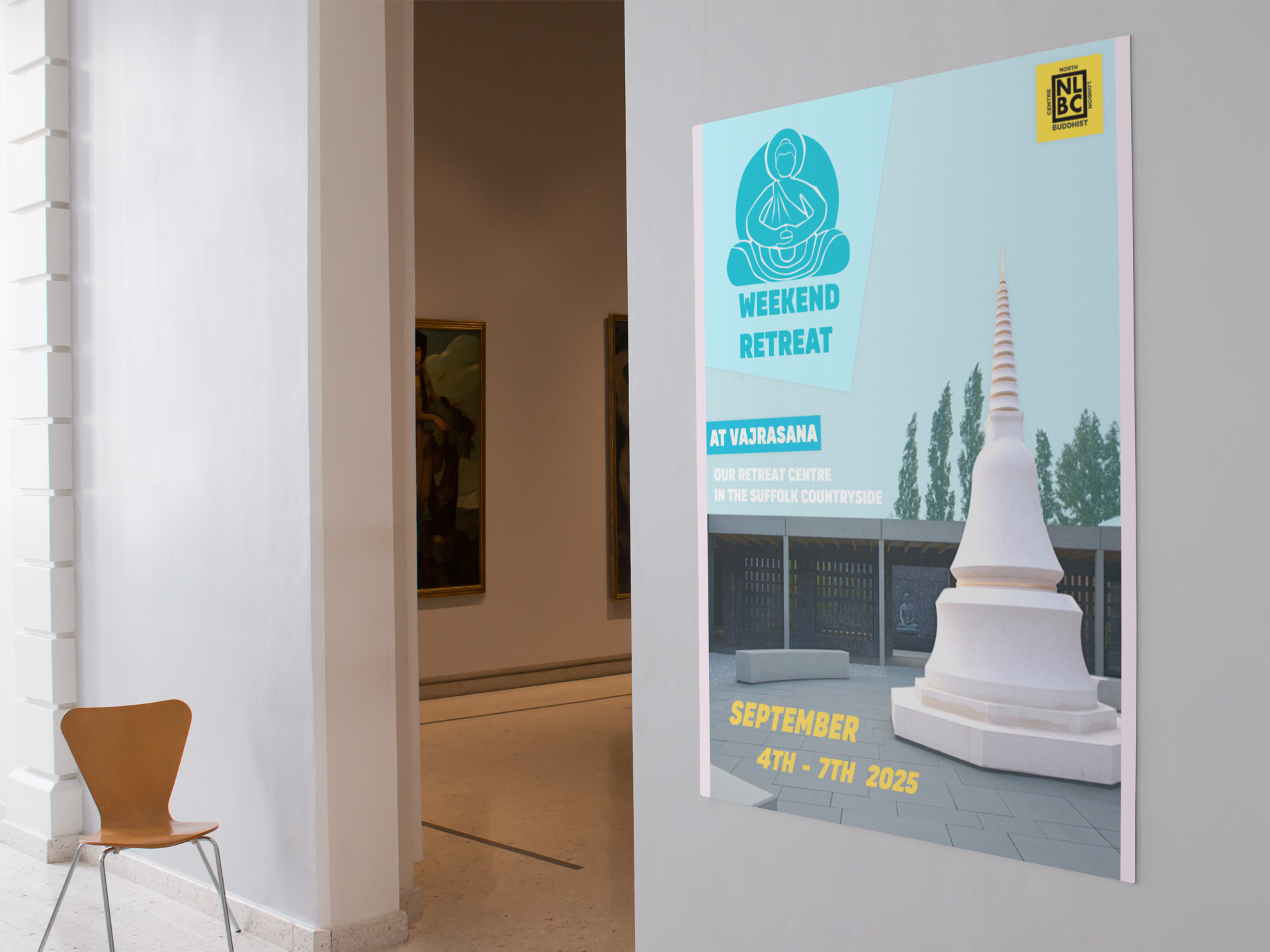
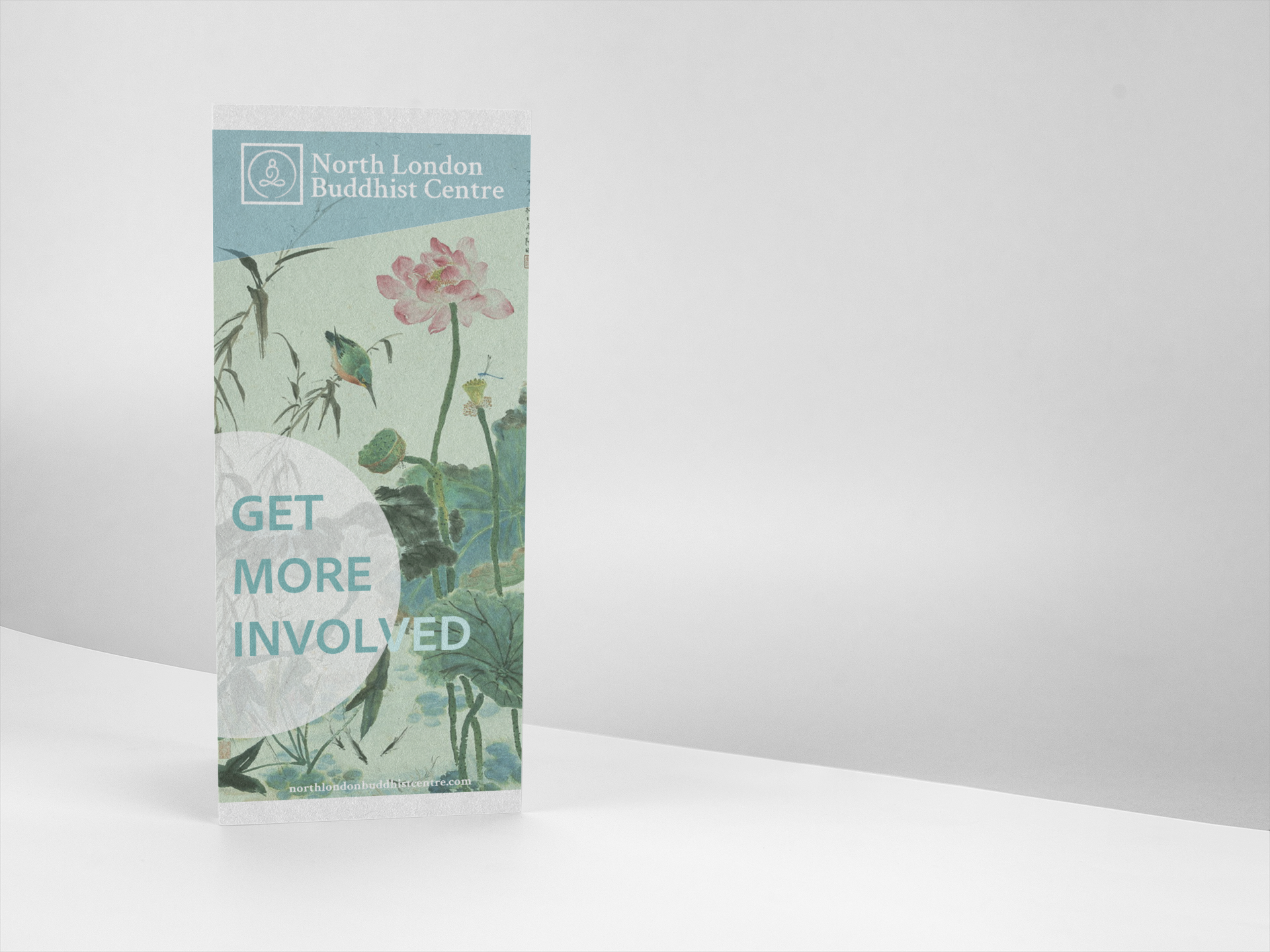
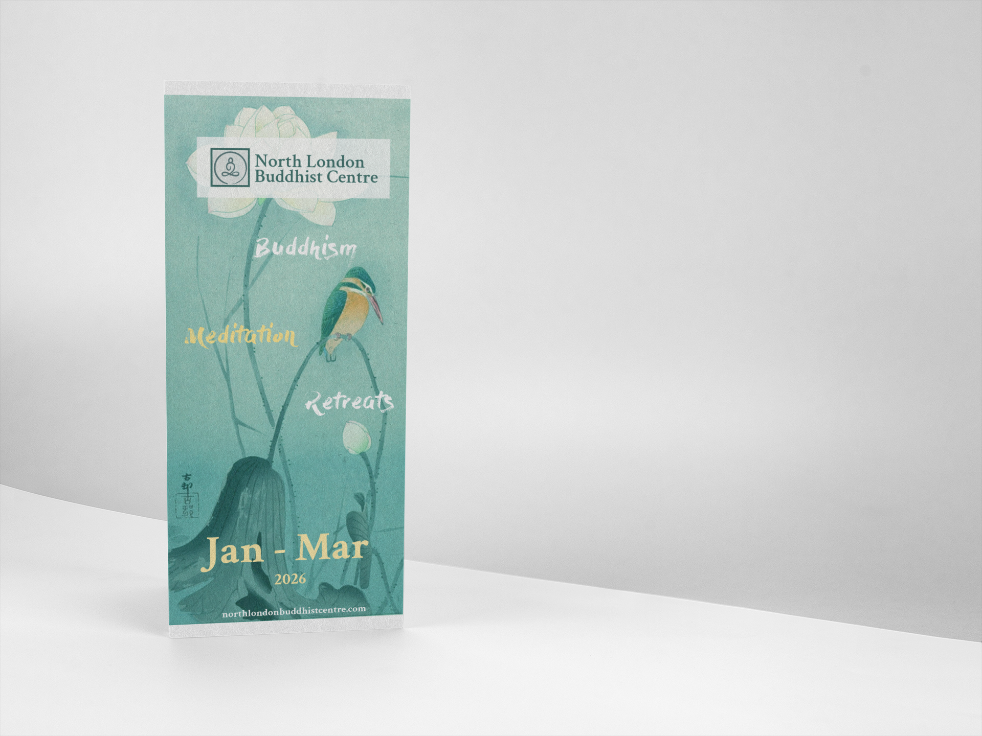
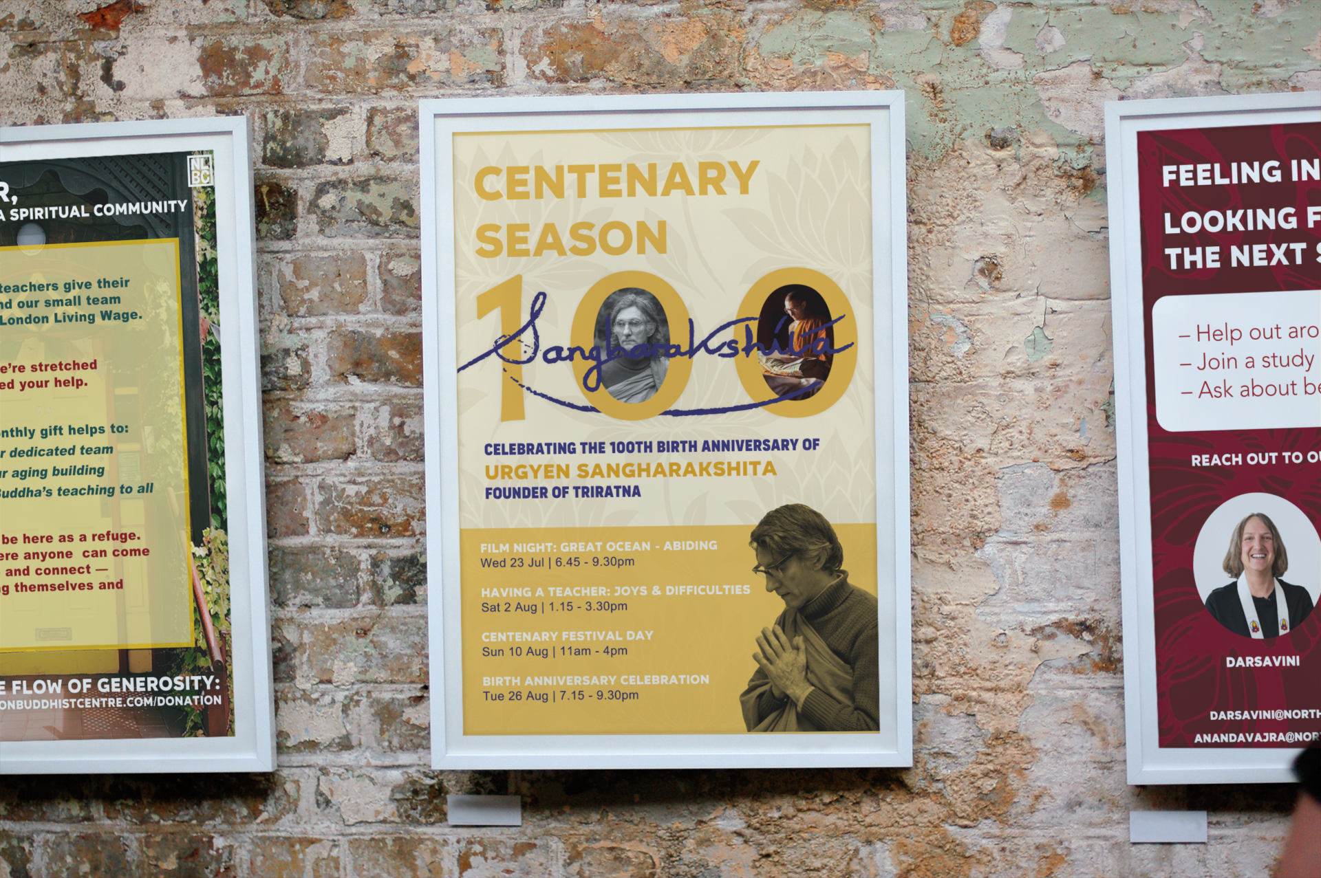
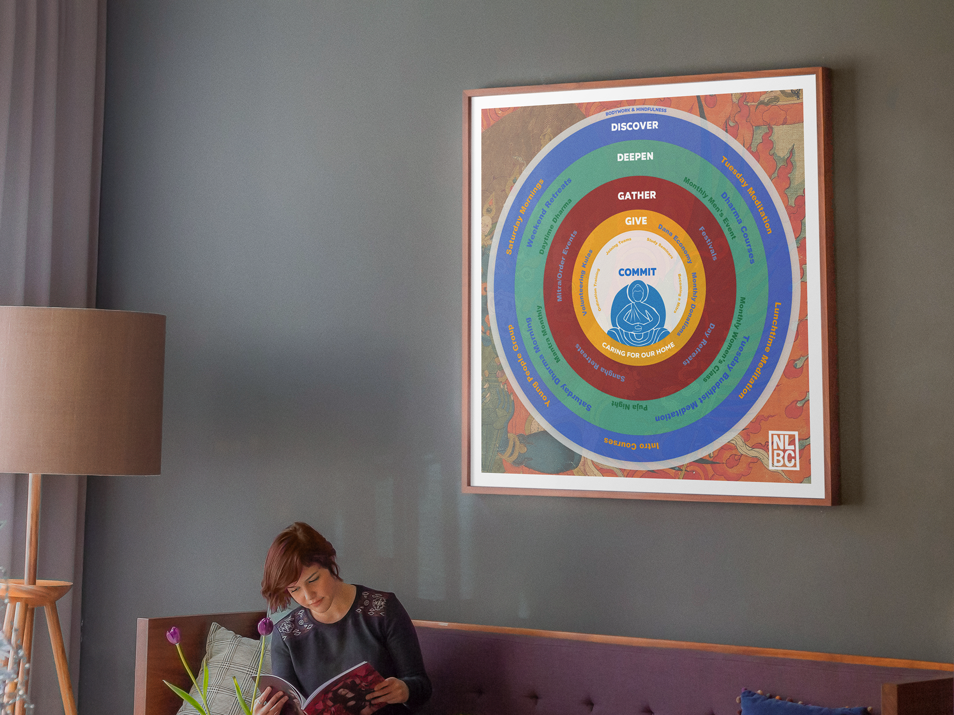
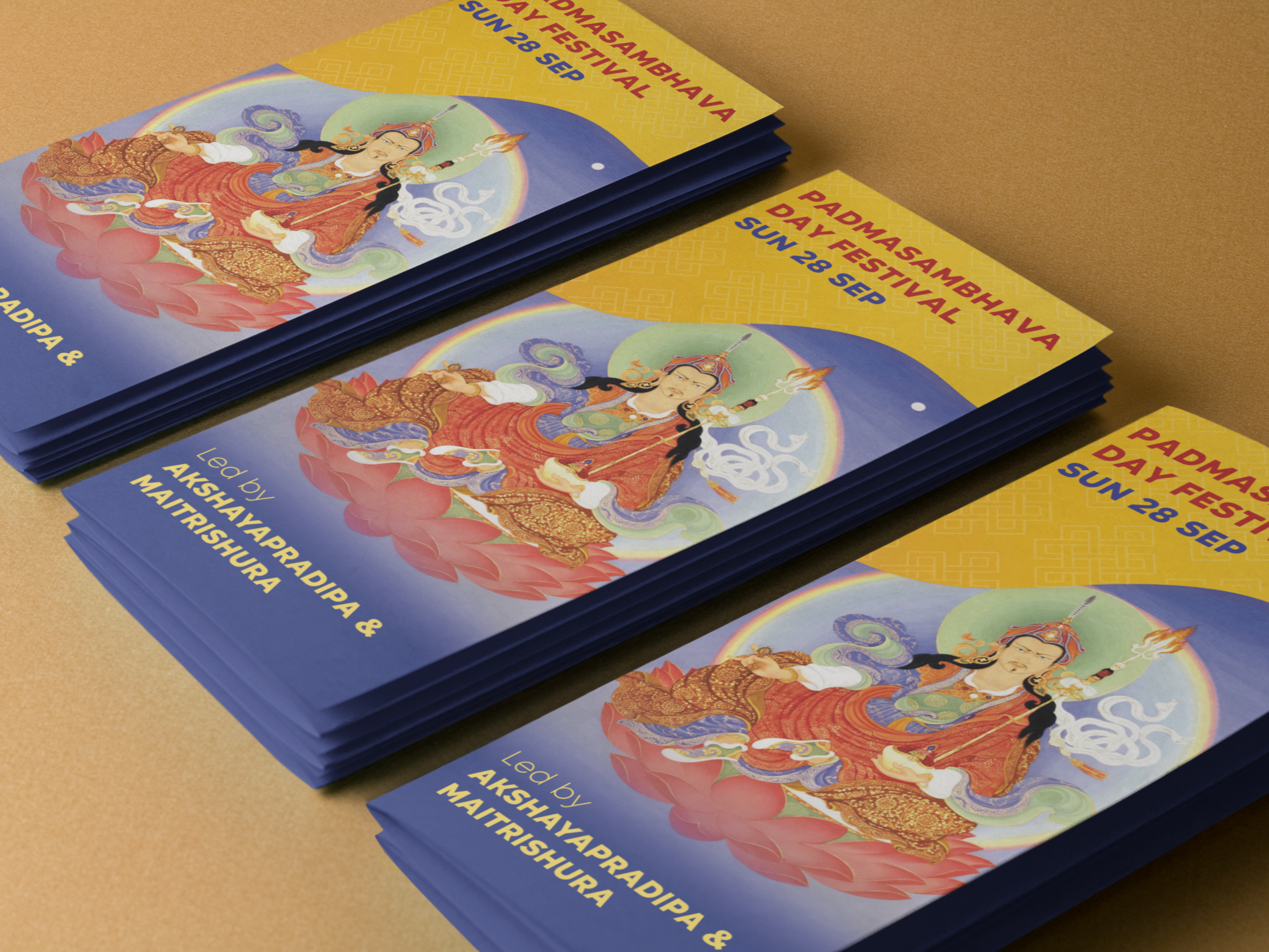
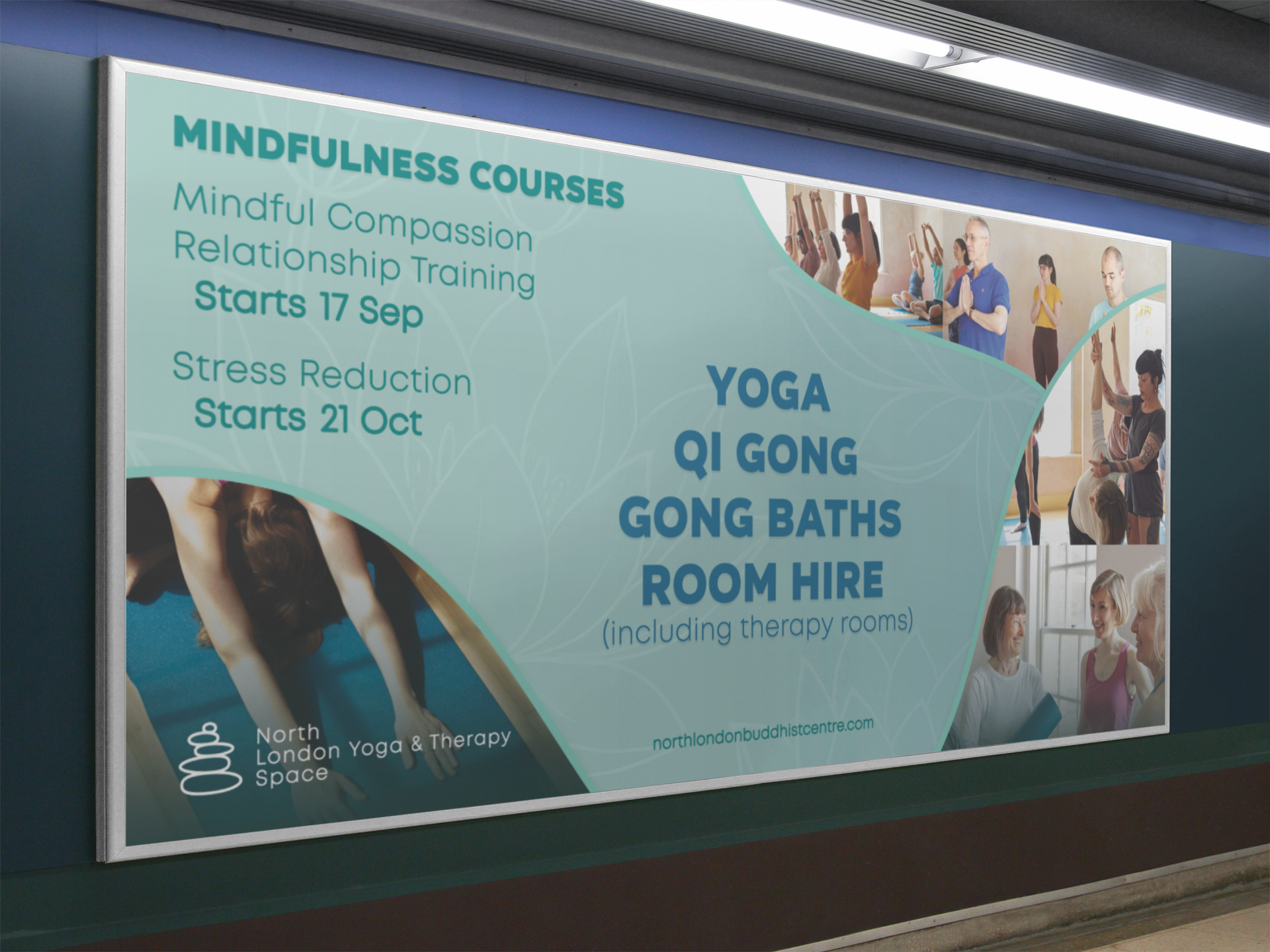
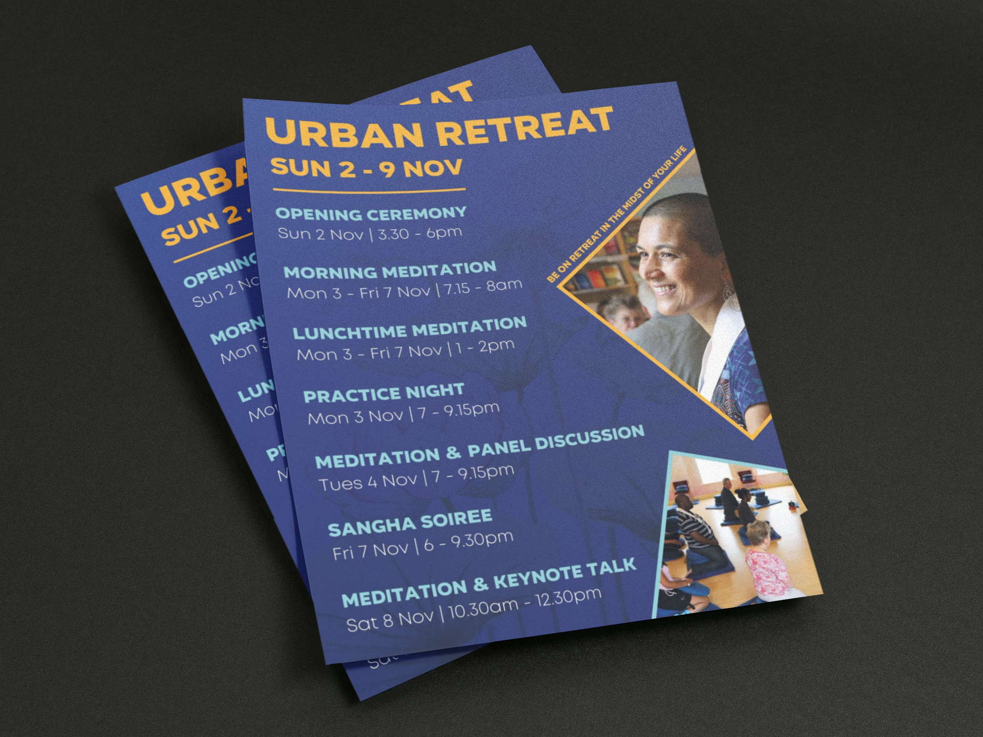
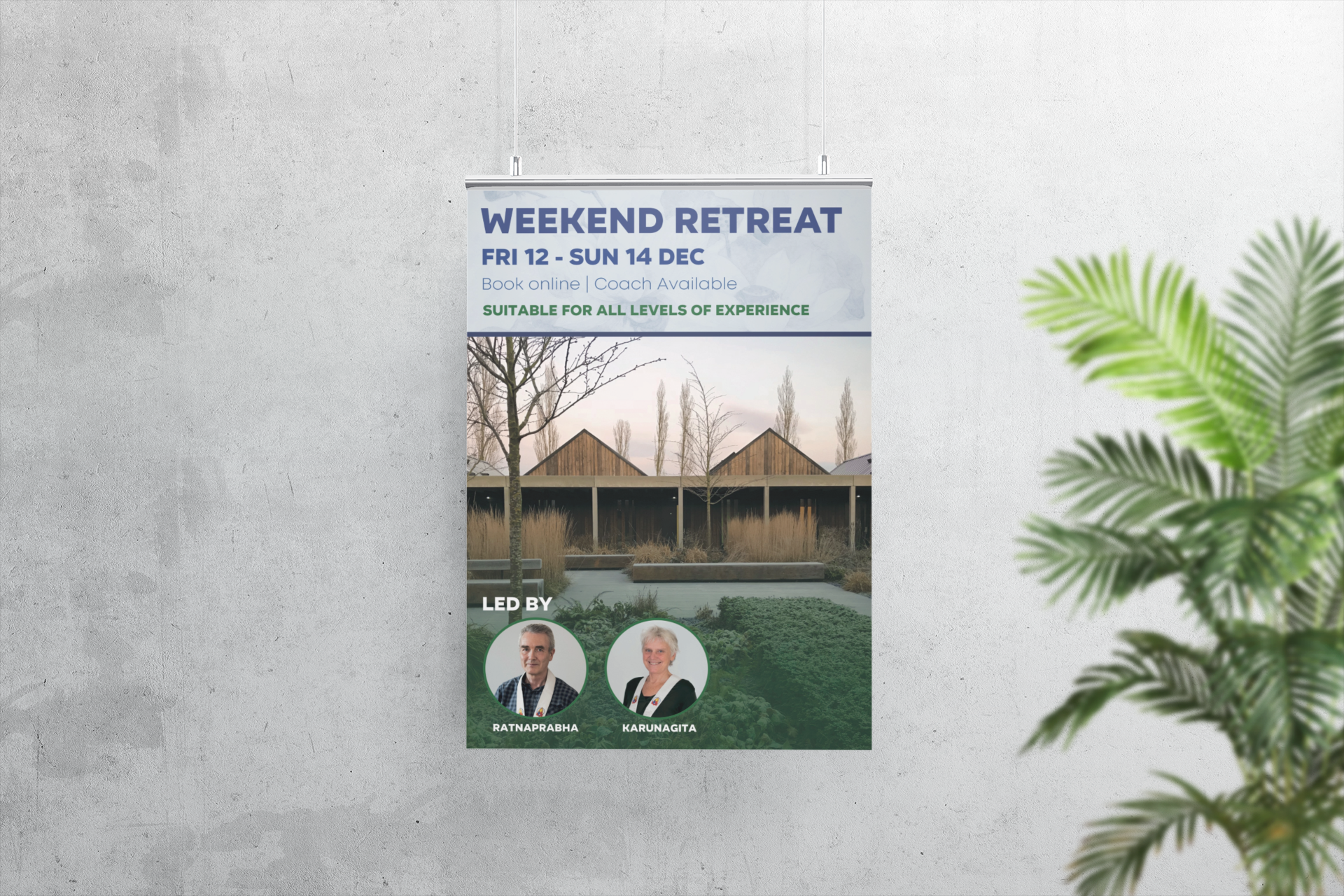
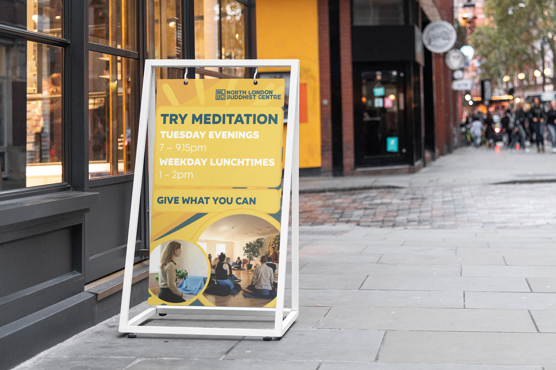
For my work with the North London Buddhist Centre, the central challenge was to preserve their established aesthetic while elevating it with more complexity, nuance, and clarity. The Centre already had a recognizable visual identity rooted in playfulness, warmth, and community friendliness, but their materials needed a refreshed energy that could engage new audiences while remaining true to their ethos. My approach was to refine and expand their design system—introducing layered compositions, dynamic color palettes, and thoughtful typography that brought greater depth without overwhelming their approachable brand presence. Below you will see a mix of older elements from their past brand identity, the current ones I have implemented, and my suggestions for future design improvements, all working together to create a more cohesive and sophisticated visual language.