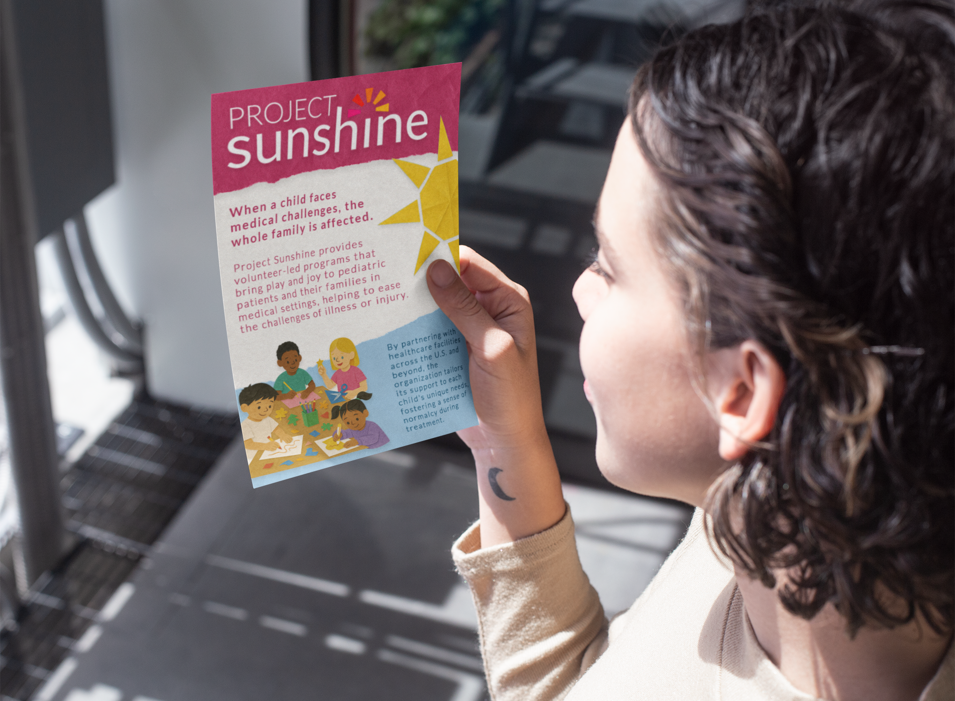
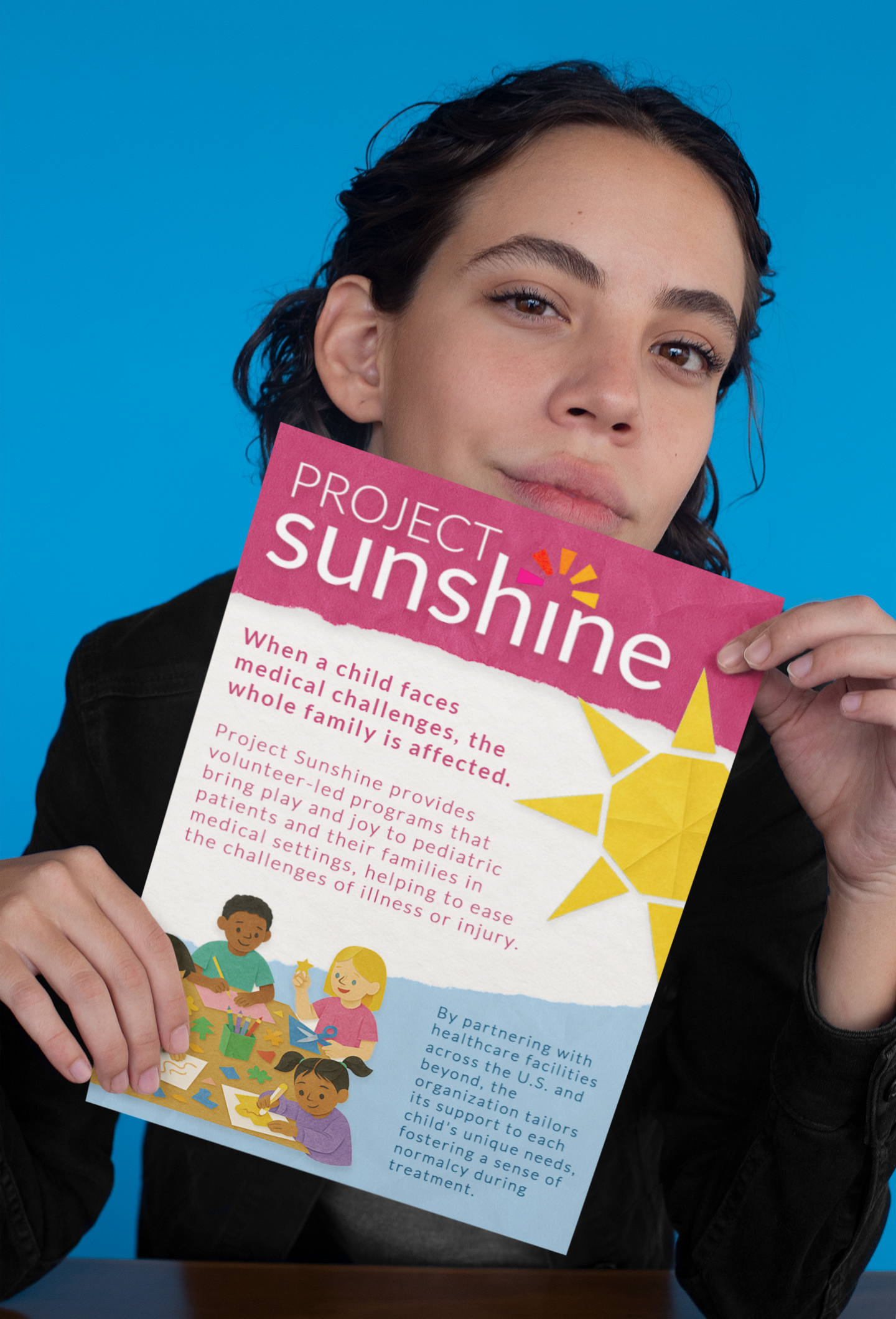
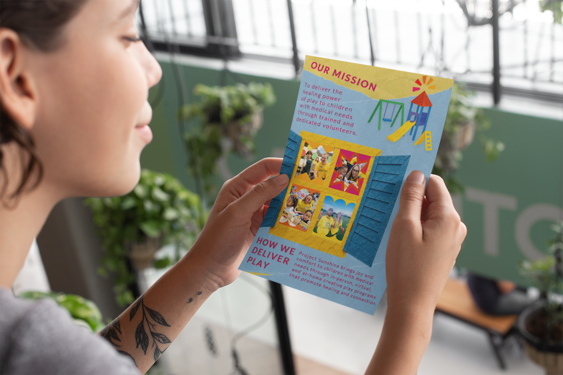
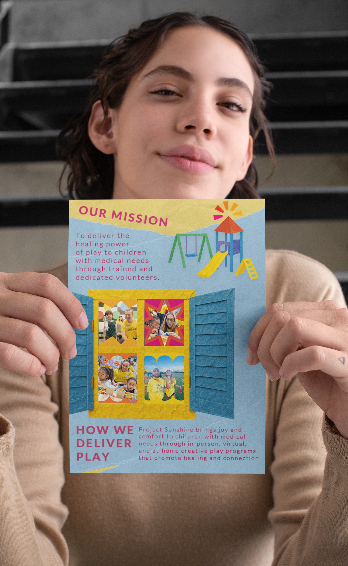
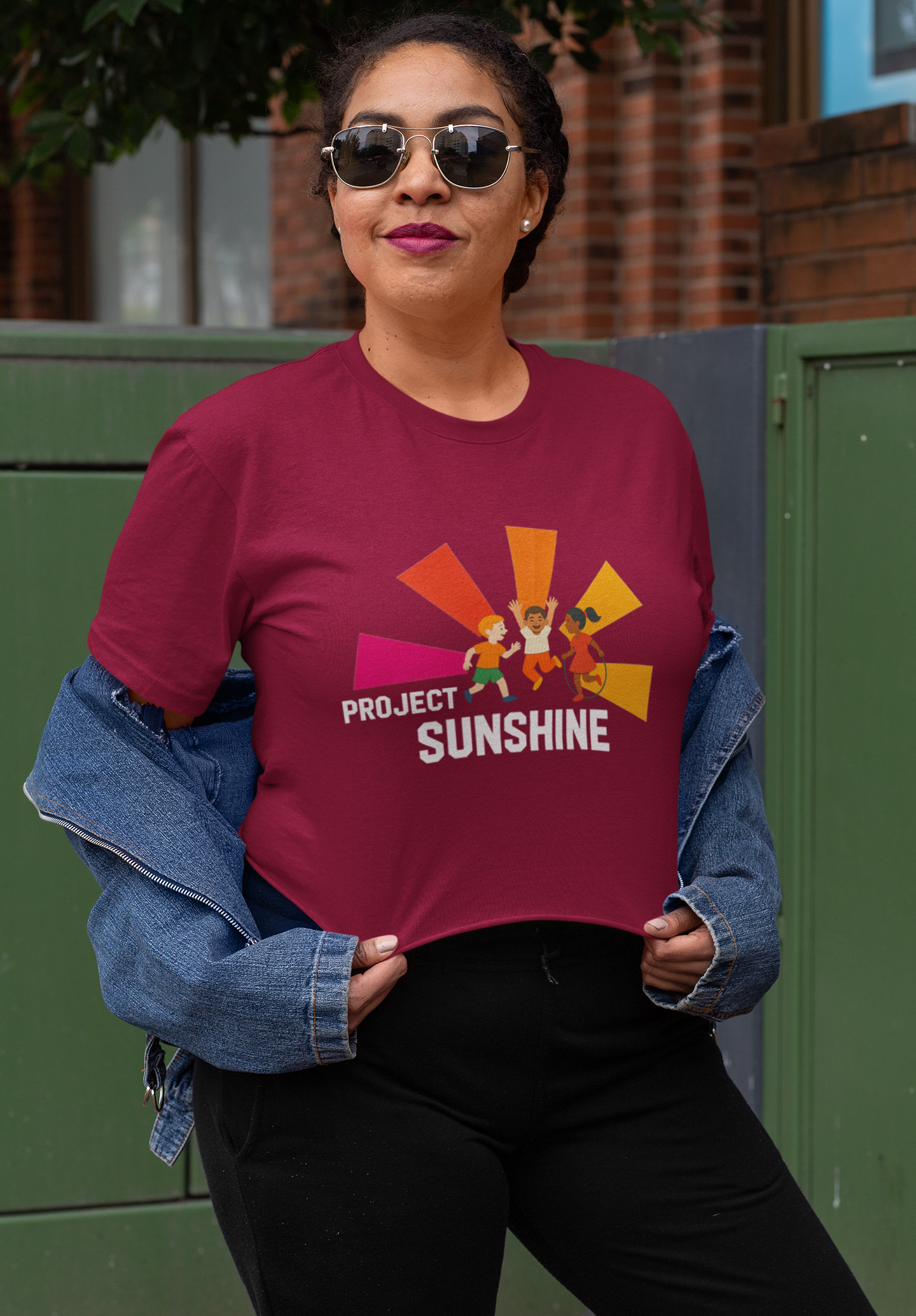
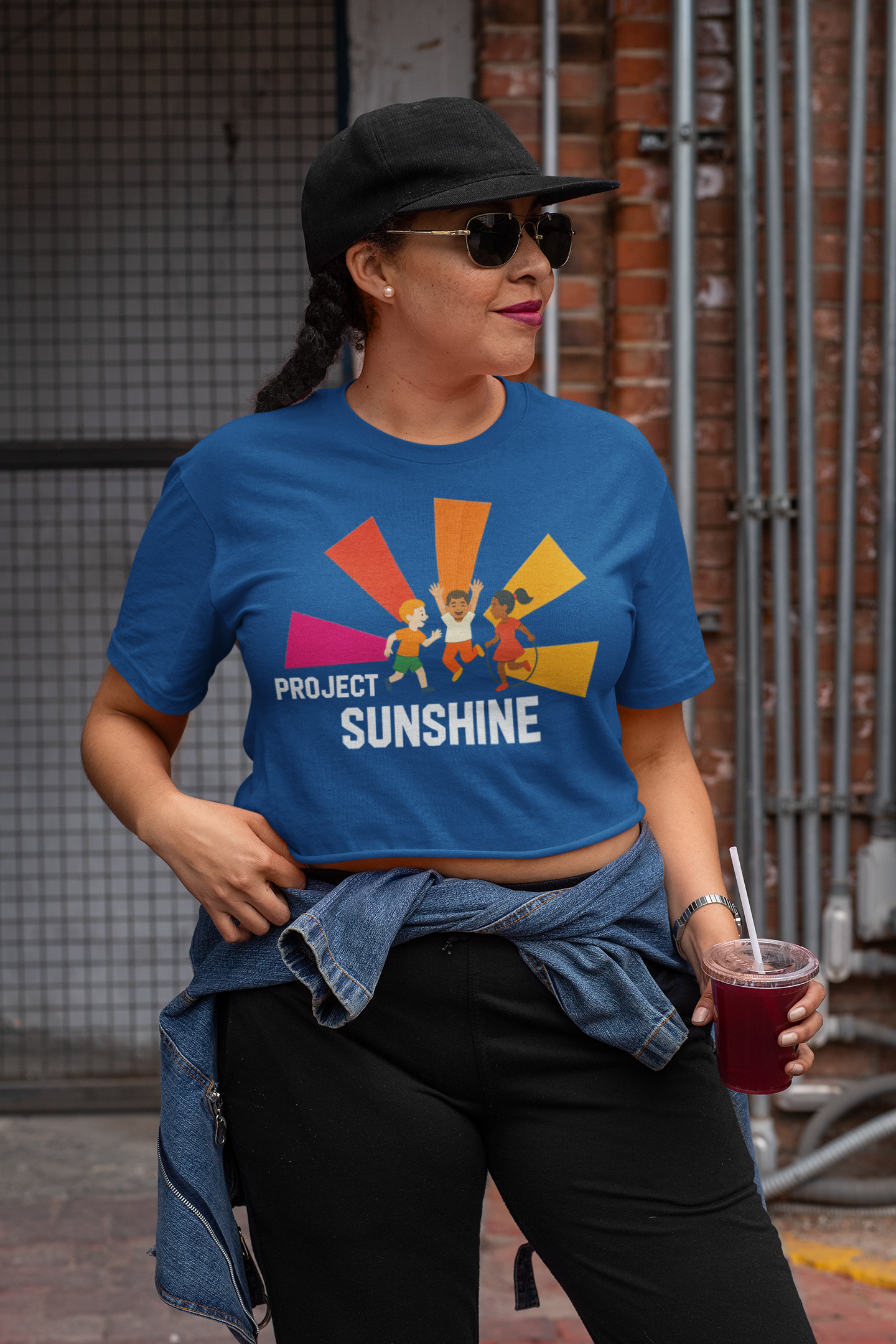
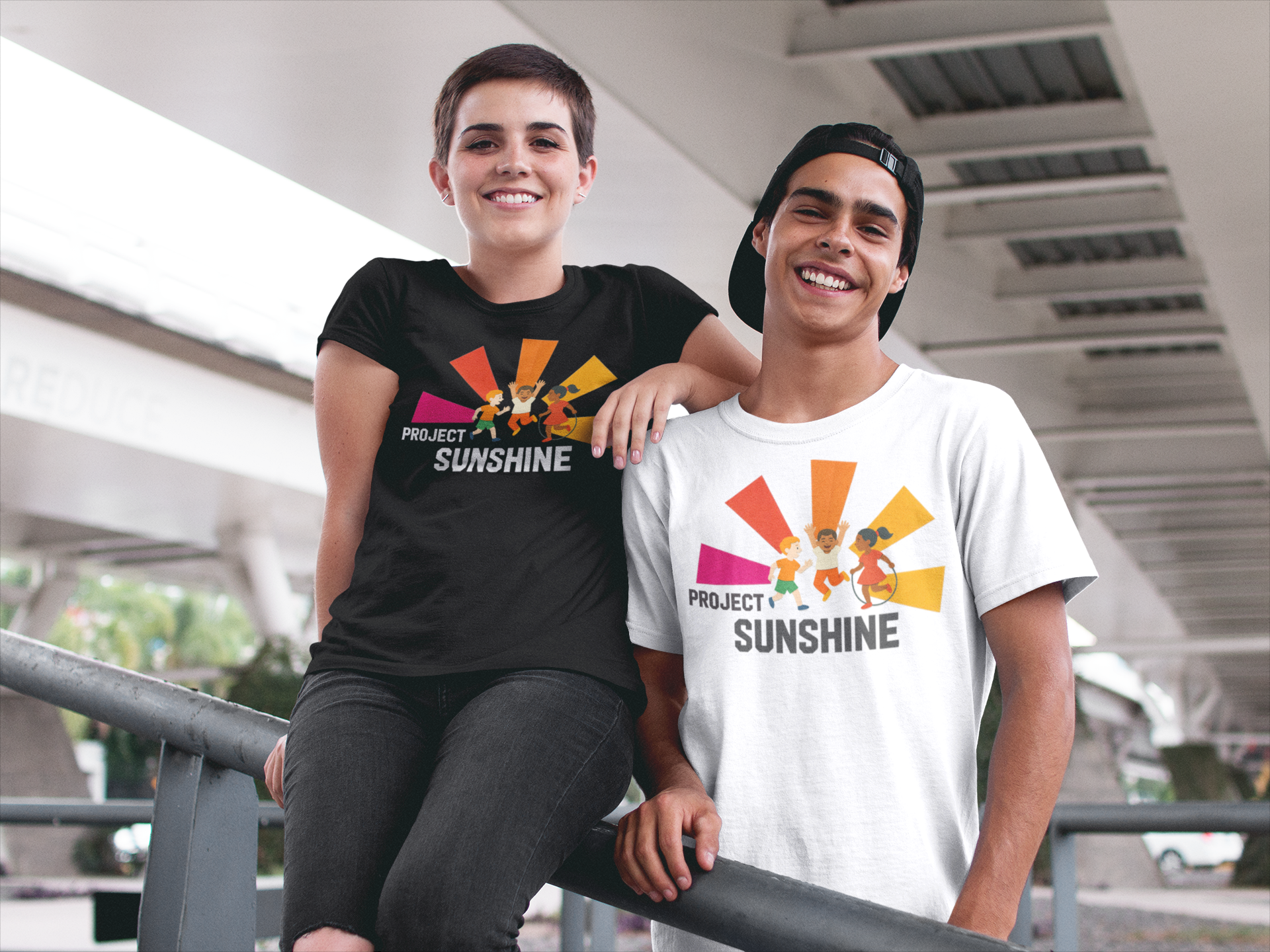
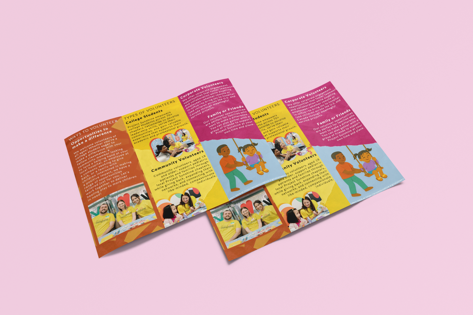
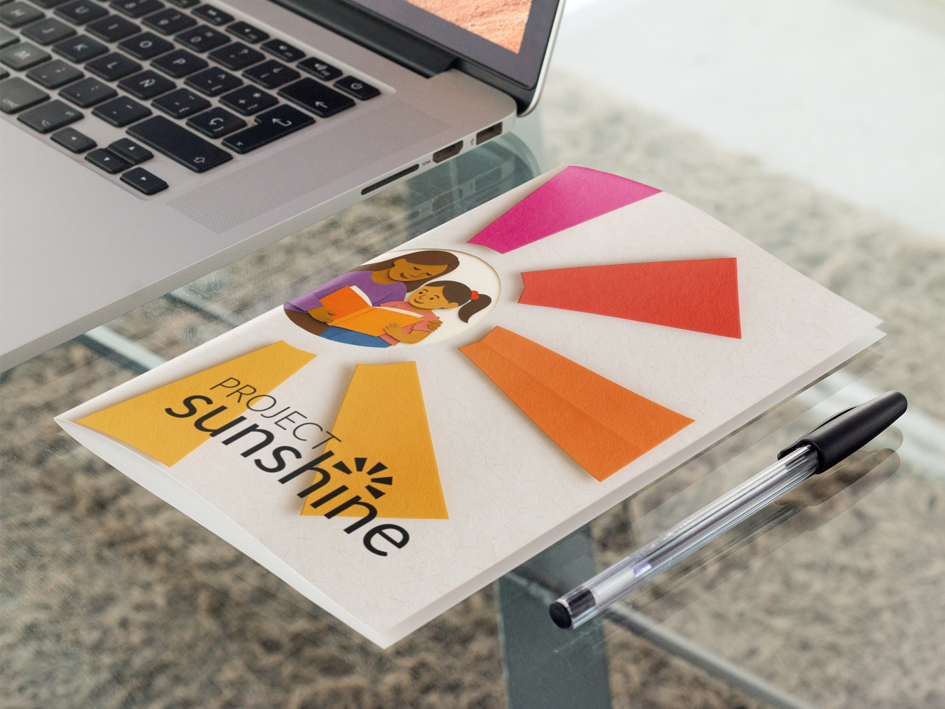
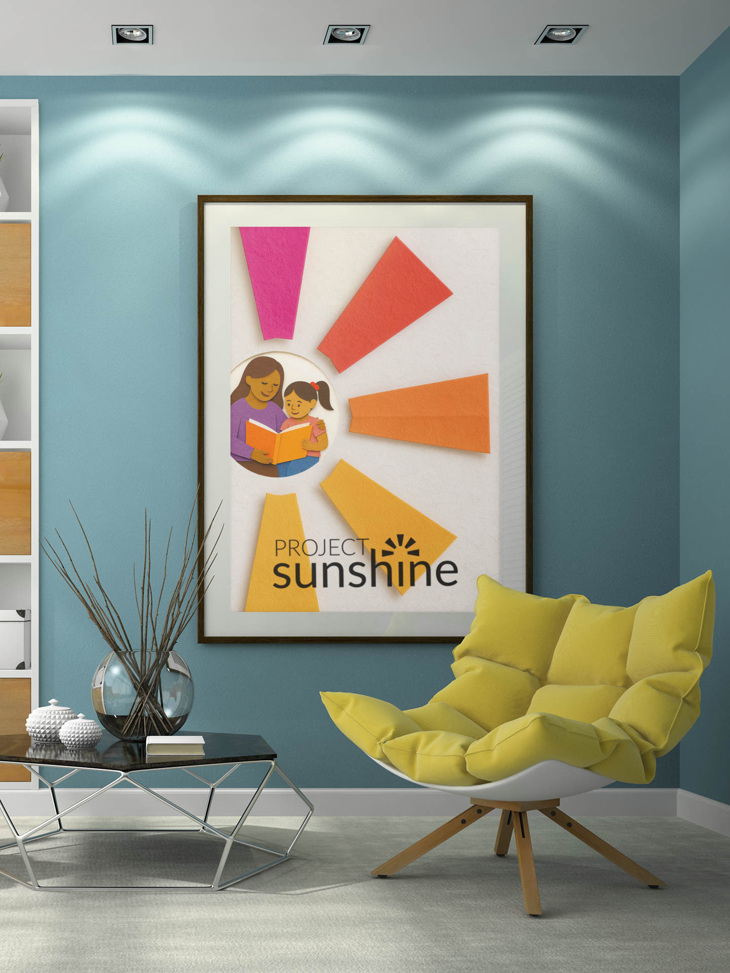
For this project, I wanted to keep the design inviting, family-friendly, creative, yet professional—emphasizing design consistency across all touchpoints. From flyers to brochures to branded t-shirts, my goal was to create a cohesive visual identity that felt warm and approachable while still polished. Bright colors, playful illustrations, and clear layouts were used to capture attention and communicate the organization’s mission in a way that resonates with both children and adults. By applying the same design language across print materials and merchandise, the brand message feels unified, accessible, and memorable.